
Turning Color into Cash
STORY BY BROOKLYNN JOHNSON
photo by Jake Parrish | infographics by Rachel Simons
The different shades of marketing
WAKE UP.
Turn on the light. Yellow. Make the bed. Purple. Walk to the kitchen. Turn on the coffeemaker. Black. Grab an apple to eat. Red. Take a shower. Grab the shampoo. No, not that one.
Grab the pink bottle. Get dressed. Put your jeans on. Blue. Zip up your jacket. White. Fill your coffee mug. Green. Lock the door. Silver.
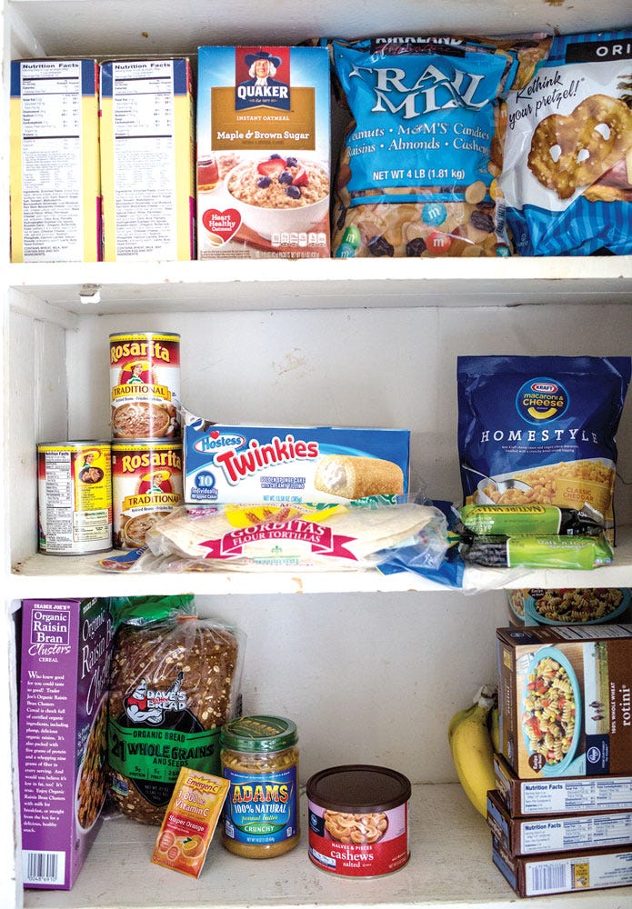
Colors are all-around us. Many of the colors that build up each person’s homes and day-to-day lives are chosen for them before they hit the stores. Graphic designers and marketers use knowledge of color and respective human response, an idea called color psychology, in their creative process.
“People make up their minds within 90 seconds of their initial interactions with people or products. About 62 to 90 percent of the assessment is based on colors alone,” according to the article “Management Decision,” written by Satyendra Singh.
It is fairly common knowledge that color is made up of different wavelengths of light coming into contact with the eye, but marketers have figured out a way to put this science into a social context and have been turning color into cash.
Rebekah Leigh is a freelance graphic designer in Seattle, who graduated from the University of Oregon with a degree in digital arts and graphic design. She uses her knowledge of color and emotional response when working with her clients.
Leigh designed a set of blue and white business cards for a client who worked with massage therapy, she says.
“I came up with that color scheme for her because, to me, it was a color scheme that gave a relaxing vibe,” Leigh says.
The colors seemed fitting for the atmosphere of a massage parlor.
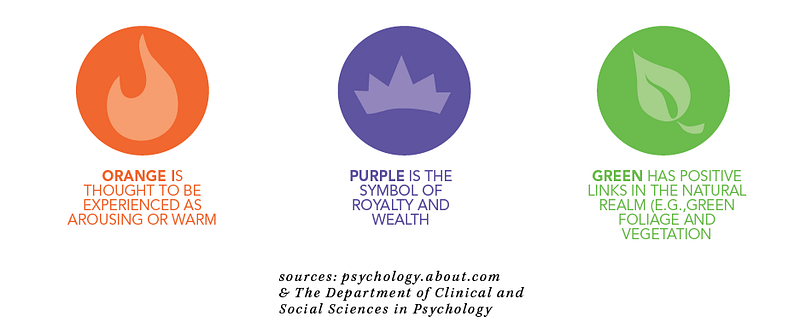
Leigh recalls showing the client a set of orange business cards. The owner of the massage parlor was immediately turned off.
While orange for the massage parlor may not have been a good fit, another of Leigh’s clients, an owner of a laser printing company in Mexico, felt orange was a perfect fit for his own business cards.
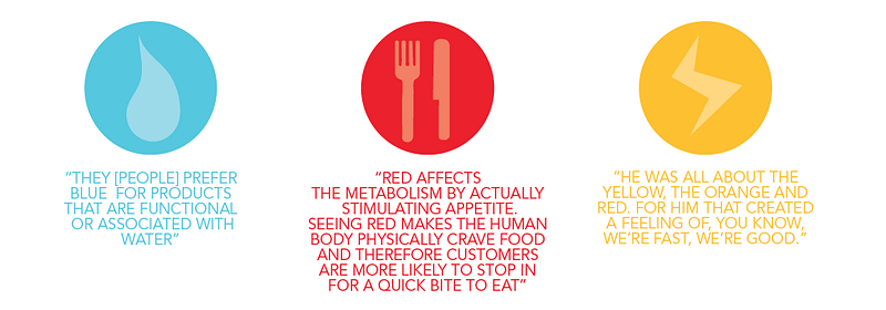
“He was all about the yellow, the orange and the red. For him that created a feeling of ‘We are fast, we are good,’” Leigh says. It was masculine for him, she says.
Color helps to sell a service. Specific colors are associated with certain services. McDonalds. Red Robin. Pizza Hut. Dominos. What do all of these places have in common?
1.) They sell food to consumers.
2.) Their logos use the color red.
According to the article “Management Decision,” the color red creates a physical response in the human body. Red affects the metabolism by actually stimulating appetite. Seeing red makes the human body physically crave food and therefore customers are more likely to stop in for a quick bite to eat. Logos are not the only way restaurant marketers take color into account.
Sit-down restaurants often paint the walls blue; a color often associated with relaxation, to create a calm, pleasant vibe for their guests, according to Singh.
A pleasant environment increases a customer’s likelihood of remaining at the restaurant longer and ordering more food or drinks. A positive experience can lead to a returning customer, leading to more sales. Colors are direct factors of restaurants’ financial success.
The whole idea of color psychology in marketing is to improve the consumer experience, in environment and product satisfaction. Blue stores are perceived to be calming and less crowded than those of other colors. Furthermore, customers want to buy products in the colors that match their function, according to the article, “Color Psychology: Effects of Perceiving Color on Psychological Functioning in Humans.”
“They [people] prefer blue for products that are functional or associated with water, and prefer red for products that are luxury items or are associated with status, such as a sports car,” according to the same article.
Would a can of Coca-Cola be recognizable at first glance without its signature red label? Would the famous “golden arches” of McDonalds still stick out in the line of sight if they were a color besides yellow?
Color gets integrated into the brand of the company — becoming a point of recognition for the brand. The red of the Target logo has been integrated into the cooperation’s identity — red shopping bags and red shopping carts. The white logo representing Apple products is seen in the company’s computers and iPads.
While certain colors have specific associations in general, it is important to remember that each individual’s color preference is a matter of personal opinion, Leigh says.
“Any color can have any meaning to any person,” she says.
Despite the fact that individual opinions form when it comes to color, designers and marketers have capitalized on American consumer, and buying, trends, where color contributes to a multibillion dollar behavior — and that’s a lot of green.